top of page
Art
UCSC Resources Mock-up
How can we redesign the landing page for free UCSC resources to be more student friendly?
OVERVIEW:
-
I worked in a team to design a central landing page for UCSC students where they can access and find all the free resources that they have access to as students.
-
This was a 10 week group project for my CMPM 178: Human Centered Design Research course.
-
This course was structured around using IDEO Methods throughout the design process.
-
Competitive Analysis, Cognitive Task Analysis, Flow Analysis. Prototyping, User Testing, Brainstorming, & Affinity Diagrams.
-
CHALLENGES:
-
This project had very vague instructions and expectations and it was a challenge to set our own standards and meet them consistently.
OUTCOMES:
-
The end result was a high fidelity prototype of an centralized resource page that described each resource and provided a redirect link that opened on a new tab.
-
Made using: Figma, Jamboard
How can we do it better?:
We want to design a better resources page UCSC students where they can access and find all the free resources that they have access to as students
Our first objective was to get a clear diagnosis of the problem. We compared, and evaluated the Resource Pages of UCI vs UCSC to establish functional requirements and areas of improvement.
We used two IDEO methods which narrowed in on five core factors:
-
Cognitive Task Analysis: Lists and summarizes user’s sensory input, decision points, and actions
-
Navigation: how can user find information they seek
-
Design: what is the overall impression - aesthetic, tone, UI
-
Functionality: what did webpage allow user to do
-
-
Flow Analysis: Represents flow of information throw all phases of a system/process
-
Functionality: what did webpage allow user to do
-
Content: landing page information
-
Site Architecture: how is information arranged
-


VS
01: Competitive Analysis
01: Competitive Analysis
How & what does the design communicate to user’s brain?:
A Cognitive Task Analysis would allow us to investigated how UCI used visual and cognitive cues to arrange their Resources page and identify decision points that are helpful to the users and those that may leave them frustrated. It involved interacting with the sight and being perceptive about what we were thinking impacted how we understood how to navigate the page.
The advantages we noticed were that the page had a clear purpose and had an easy to read text and display. Links were clearly one color and there was visual feedback in response to the mouse hover. This made the page very interactive and easy to navigate. One big problem we found was the absence of a back button and how only some links would open on a new tab while others would change the address of the current page.

02: Cognitive Task Analysis
Where do users choices take them?:
A Flow Analysis challenged us to map out the possible user journeys on the UCSC Resource page to identify ways to improve overall functionality. To complete our analysis, we engaged with all clickable parts of the website and documented where the click led to.
We found that the possible actions could be separated into two categories: Stay on Resources Page OR Get Redirected. However, there were many problems we found that hindered the redirect function from feeling intuitive. First, the UCSC Resources home page has way too many clickable links, drop-down menus, banners, and images. Furthermore, the labels of menu items are confusing, making it hard for the user to know where to find resources they need. Even the name Resources Page is inherently misleading, as when clicking the About page, you find out that the Resource Centers is actually a collection of Ethinc Resources Centers and NOT Student Resource Centers. For that, you need to click the heading Student Success which looks like a drop down menu BUT is actually a redirect link itself. There is also way too much text in the description for all of the Resource pages.

03: Flow Analysis
How can we better to organize information? By students for students.:
Affinity Diagrams are used to identify connections between issues and reveal innovation opportunities. It is put into practice by clustering design elements according to intuitive relationships such as similarity, proximity, dependence, etc. By clustering the resources offered by UCSC into categories, it allowed us, the designers, to holistically see what information could potentially be on our own website model and the way in which it could potentially be organized. The first thing we did was to identify the core lesson we learned from our competitive analysis assignment, which was that information should be clear, relevant, and navigable.

We worked on a shared Jamboard and arranged resources into 7 broad categories according to the need each resource addressed. With the use of Affinity Diagrams we were able to efficiently solve one of the main problems we had with our competitors, allowing us to have a clearer idea of what we want to build. With this newly gained knowledge we can begin to prototype a product that will address the critiques we had of competitors while still containing all the same advantages.
04: Brainstorming
Putting the plan in action:
Quick and dirty prototyping is a good way to show each other, as designers, what we envision for the product helpful in a low-stakes environment and work from there to improve the design. Using Figma, we implemented ideas from our brainstorm in order to create a quick and dirty wireframes to visualize the layout and functionality of our website.
We were able to implement the three main alternative ideas from our brainstorm:
1) Organization by Need
2) Hover/slide/drop Down Effects
3) Filters and Search tags.
 Home Screen 01: has icons and description |  Home screen 02: Circular buttons with conversational heading |  Home screen 03: block titles with leading questions |
|---|---|---|
 Main page option 1 |  Home screen option 2 (By Jesse) |  Home screen option 3 (By Jesse) |
 Hover effect experiment 01 |  Hover experiment 02 |  Filter experiment 01 |
 Filter experiment (by Jesse) |  Filter experiment 02 |
We made use of boxes to separate the distinct categories for all the UCSC resources. We also implemented icons and short descriptions so information could be easy and intuitive to find. To make the experience more enjoyable for the user, we created possible hover effects. Also we experimented with different ways to design the search filter function by playing around with drop down menus versus pop-up menus.
05: Low Fidelity
02: Cognitve Analysis
03: Flow Analysis
04: Brainstorming
05: Low Fidelity
06: User Testing
How can we better to organize information? By students for students.:
To test our prototype, we asked our users to find the Basic Needs page. Ideally, our users would click on Food Resources and then be able to find the Basic Needs tab.
In our testing , we used the IDEO method of Narration, where participants are asked to describe aloud what they are thinking as they perform a process or execute a specific task. By implementing Narration during user testing our UCSC Resources website, we are able to hear the thought process as the user navigates our site. This information will then help us better measure the intuitiveness and the navigability of the site, as well as determine what changes to make in out high-fidelity rendition.
Testing with Narration
Testing No Audio
The main takeaways from our user testings revolved around the aesthetics and ease of navigation. Our first user mentioned adding photos and color. Our second user stated that they wished to zoom in, from this we learned that we need to increase the font size of the main page and allow the subgroups to redistribute for different web page sizing and mobile use. Our second user also was trying to use the search bar, which currently is not working, so we know that the search bar is a valuable tool that needs to be implemented. We are also going to add links that connect our resource page to their equivalent UCSC pages.
06: User Testing
07: High Fidelity
07: High Fidelitly
Final Iteration:
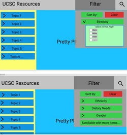
After getting feedback on our low-fidelity, our group realized that we needed to narrow down the intention of our webpage and be more specific about the problem we were trying to address. Instead of a whole new website, we wanted to make an informative landing page that would redirect students to the desired UCSC Resources page depending on their needs.
With a clearer goal in mind, we redesigned the look of our low-fidelity website to make it look more professional and modern. We decided on blue, gold, and white because those were the UCSC colors. To improve the overall look, we also added images and increased the font size as those were critiques made by our
users. We improved our drop-down menus by sorting each resource by the need it addressed.


On each main resource page, we provided a short and accurate description of what each resource offered, so users can quickly decide if the resource is suited for their needs. On the left hand side, the smaller white tabs are redirect links to the associated UCSC pages which open up in a new tab. This way our page had a consistent template of what pages were informative and what buttons would redirect the user. We also attempted to add a dynamic aspect to the resizing of the pages so our web page would look good on mobile or desktop.
One big change we did was getting rid of the “filter by you” option. In an ideal situation we would associate tags to each resource however the tool we used prevented us from implementing this. We have the same issue with the search bar as well. Overall, our high fidelity prototype presents an alternative way for students to learn about UCSC resources and find support when they need it. The next step of this site would be to build an HTML website from scratch with a CSS overlay. With a hard coded site, filtering and the search bar could become functional and the generated CSS code, by Figma, would simplify the process.
My Takeaways:
I learned different methods to understand root cause of problem and also picked up core IDEO design thinking principles. A designer should always test to see what different ways could a design be improved using get real life feedback. It was fun collaborating and sharing ideas with team members and I really enjoyed the team dynamic. I realized that I became energized to work on a problem that impacts community I am a part of, in this case students. I hope to be able to relate to different audiences and design solutions for those communities.


-
You can access the final Figma here ->
-
Kudos to Instructor: Sri Kurniawan
-
Kudos to group members: Lucky M., Jesse S.
Learnings
Mock-Up Learnings
bottom of page